While this captures the essences of hills and valleys, there are problems that need to find solutions, notably the part played by the water... and by Canada and Mexico.
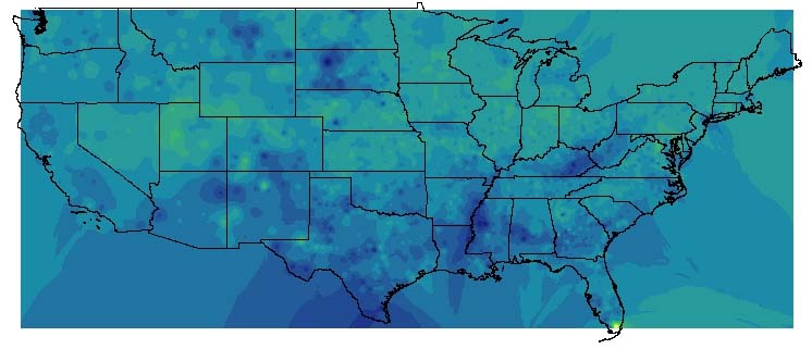
I made a .shp file of county centroids, using an extension for ArcView 3.2, and then used that as a basis for this surface:
While this captures the essences of hills and valleys, there are problems that need to find solutions, notably the part played by the water... and by Canada and Mexico.
From the Spatial Analyst Interpolate to Raster ==> Inverse Distance Weighted
(I made R:/global/uscounties/ginicentroid.shp to contain BOTH the Gini data and the points...)
a Spline of ginicentroid produces garbage; a Kriging works nicely (usgini8v.mxd)